.png)
Copy these simple CEO dashboard examples and become an all-knowing visionary with the ultimate control over your company’s future.

Introduction
The CEO dashboard is a very underutilized management tool in small business today. This is true even though the right dashboard is an almost magical instrument that can deliver astounding insights to the owner of a business.
Imagine trying to drive a car that has no windshield to view the road through, no way to know where you’re going or at what speed, or even whether you have any fuel in the tank to make the trip.
That’s how many hard working CEOs are managing their businesses today.
Without a well-designed dashboard, business owners miss out on the veritable gold mine of information that will reveal the true answers they need to succeed.
When it comes to establishing a unique dashboard for your business, the first step is to figure out what KPIs to track. If you haven’t done that already, see our post on which KPIs to track for your business. It will help guide you.
If you’re ready to go to the next step of designing your own custom dashboard, read on.
The Design and Layout of the Best CEO Dashboard
Your CEO dashboard should be designed in such a way that it does much of the thinking for you. So when you view the dashboard, it actively leads you to the answers you seek about the business.
This is the most important principle being conveyed in this article.
But what exactly does this mean?
It means that you should be able to visually see what areas of the business need to be addressed from your first glance at the dashboard, then be able to drill down into the various departments from there for even greater insight and ultimate answers.
How is this accomplished?
The Dos and Don’ts of the Best Dashboard Design
Do represent only the major divisions of the business on the primary dashboard page.
Any business can be divided into 5 general parts. These are:
Customers, Sales, Production, Expense, and Profit.
These areas of business should be your dashboard starting point because all other sub-metrics will fall under one of the above headings. How you label the above functions on your own dashboard would be based on your unique business and the industry you're in.
The reason these groupings are used on the primary dash is because any well-functioning profit machine goes through the following basic actions in order to be gainful:

The amount of individual metrics displayed on your primary page would depend on the size and type of company you have, but they should all fall under the main headings as above.
Here's an example primary page of a dashboard in a small company:

This type of dashboard design is simple and easy to look at. But more importantly, a business owner can glean some real meaning from it in just one glance.
The example above shows that leads are going up quite a bit, but sales are heading down to a similar degree and have recently fallen below the expense line (the orange dash line on the Total Sales graph).
The general problem just jumps out at you. The failure to convert the leads to sales is causing the production and profitability to decline.
When the major divisions of a business are juxtaposed like this you can easily see where your attention needs to be. A picture like this actually directs your attention.
A display like this provides the narrative of the business, not just data. Just like reading a story, it puts your business data into proper perspective.
In the example above, further investigation by drilling down into the leads and sales areas would help to uncover why the sales are faltering.
Once you find the source of the problem, the solutions usually become quite obvious.
Do use line graphs on your dashboard
They are cleaner and will paint a clear picture about what’s going on in the business. Their linear quality makes it easier to see the trends (direction over time) of an area as well.
Examples:
What is easier to get more meaning from at a glance…
this?

or this?

It's obvious the line graphs provide the clearest depiction of how the business is performing.
The graphic above shows a breakdown of the Total Combined Leads on a separate page of the dashboard. You can see that the “Leads from Google” graph has almost an identical configuration as the “Total Combined Leads” graph.
This indicates that the Google leads are influencing the overall company leads, and consequently the company sales performance, in a big way.
This would be very important to know when looking for the cause of the decreasing profits in the company.
(Whenever you see 2 or more identical looking graphs from different but related areas of the company, it’s very likely that one is actually causing or influencing the other.)
In the case above, the next question to ask would be, “Why are these Google leads not converting to sales?”
In other words, continue to drill for the source of the problem.
Now, back to the subject of line graphs being the best type to use on a dashboard…it doesn’t mean you can’t strategically use other styles of charts as well. Gauges, thermometers and bar graphs are very useful in the right context.

In the example above you can see on another page of the dashboard that Brad is the salesperson who is getting the lion’s share of the Google leads that are coming in. His sales and closing percent are being negatively impacted by these leads in some way.
Note the correlations in this next example below.
When comparing the company graphs of “Total Combined Leads” and “Total Sales” to Brad’s individual Leads and Sales, you can see that they’re almost identical in configuration.
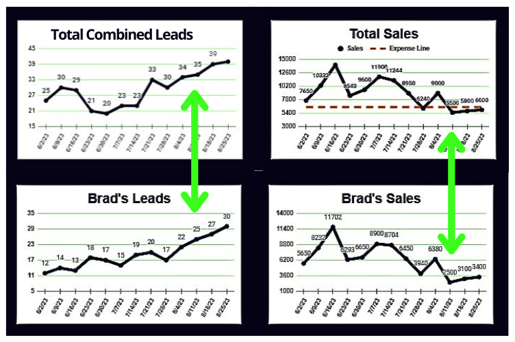
This demonstrates that Brad’s performance is impacting the overall company in a major way. These graph comparisons above also corroborate the fact that you’re on the right path to ultimately solving the profit problems.
See how much easier this could make your job as a CEO? At this point you wouldn’t have to focus on anyone or anything else in order to get an immediate handle on and improve things.
(Note: these discoveries wouldn't be a call to lay blame at Brad’s feet. It's just confirmation that he needs some help and guidance in performing his job or dealing with these Google leads in some way. There may be something off with the leads he’s being provided.)
So, the comparison of one area of the business to another is just one more reason why the use of line graphs is so beneficial when designing your dashboard.
Now, using the above examples, we've narrowed down the source of the profits decline to a couple specific areas of the company: Google leads and Brad’s struggle with them.
But we still don’t have the definitive answers yet as to what is causing the struggle.
Our next pro tip will help explain the best way to display the more detailed dashboard data in order to finally uncover the cause.
Don’t flood each page of your dashboard with too much information
Trying to display as much information as possible on one dashboard tab is the wrong objective when designing its layout. Too much data is overwhelming in the same way that too little data is useless.
If it’s hard to look at, let alone decipher, then there is too much information in one place.
You can make seemingly infinite amounts of data available in a user-friendly format by creating several tabs or sheets of dashboard. You would include links on each page to navigate from one related department to the next.
In this way you won’t overwhelm yourself with data dumps that can obscure business situations that you need to be aware of.
Obscuring things by overloading a CEO dashboard is a common mistake. Sometimes it looks impressive to infuse the dash with all sorts of cool charts and integrations.
Don't design your dashboard for the sake of design. Design your dashboard so it will help you find the answers you need.

You can see in the example graphic above, having so much information to decipher all in one place can be almost paralyzing to a business owner. A CEO will start dreading having to look at it every week and the dashboard will fall out of use quickly.
Included under the same category of making sure you don't display too much data all at once, is making sure not combine the less important data with crucial information. This would also make a dashboard difficult to view.
It’s essential that you organize your information in a hierarchical format so that vital business information is at the forefront, and the details can be drilled down into if necessary to magnify or clarify a situation.
This is why we design the primary dashboard page showing only the company's major divisional KPIs as a top-rung priority.
In the example of Brad's declining sales, the next steps need to be taken in order to get at what is actually causing his difficulty.
This is where it is useful to have links to Brad's detailed "leads list" and "sales report" incorporated into your dashboard.
In this way with just one click you can see the details of the Google leads that Brad is being given, and what happened with each attempt at selling them.

This trail of hunting for the cause of declining profits in the business would finish up with an in-person interview with both the marketing manager and Brad to help them come up with a plan of action to improve things based on what you found.
The Problem Solving Properties of the Right Dashboard Design
It's easy to conclude from viewing the examples in this article that if the dashboard design had been one big, indiscriminate pool of information that didn't clearly show the important correlations, it’s very likely that the true cause of the declining profits would never have been recognized as such, and a really bad situation could have gone on for a long time.
That is the importance of having the right dashboard design for your business.
Next Steps to Create Your Own CEO Dashboard
Choose which software you’ll use to create your own dashboard.
If you don’t currently have Google Sheets, you can go here to sign up for a free trial of Google Workspace (which includes Google Sheets among many other business solutions) and try it out for free. We may receive a one-time commission at no extra cost to you.
If you have Microsoft Office you can easily apply these examples to Excel.
You can create the dashboard yourself if you’re savvy when it comes to Sheets and Excel, or you can hire a freelancer and give them their marching orders using the examples in this guide.
Thanks so much for checking out our post on creating the best CEO dashboard (ever). We hope you got a lot out of it.
For more information on which KPIs you should track or how to analyze them, check out these posts:
If you create your dashboard using the examples contained in this article, holler back and let us know how it went. We love to see your success in small business!

.png)
.png)
_edited.png)
.png)


Comments